
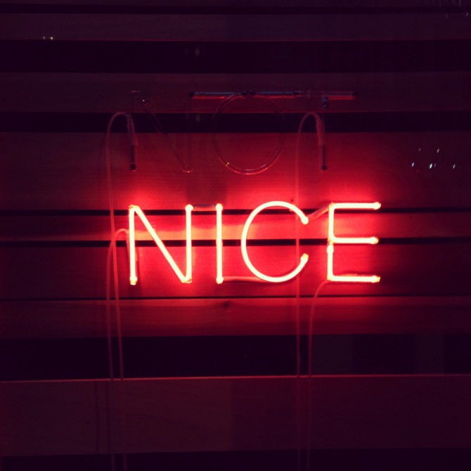
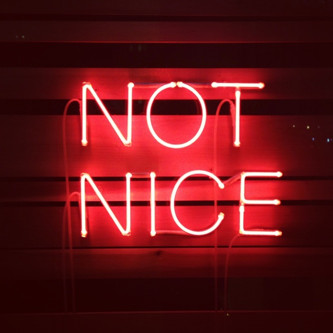
both works by David Shrigley at BQ Berlin (09. - 10. 2013) courtesy BQ Berlin // photos by artfridge
Just type the three words "neon sign art" into the google image search field. You will be presented an infinite gallery of ironic, poetic, theoretical, romantic, senseless or meaningful slogans. Everybody likes them. Including me. Berlin officially declared its love for neon signs when Maurizio Nannuccis red glowing work "ALL ART HAS BEEN CONTEMPORARY" was installed 2004 above the neo-classical columns of Altes Museum. Also Robert Montgomery's beautiful public poetry project, such as “The People You Love Become Ghosts Inside of You and Like This You Keep Them Alive”, adorned Berlin's cityscape for quite some time. At the latest during the opening of Joseph Kosuth's neon public-language retrospective INSOMNIA: ASSORTED, ILLUMINATED, FIXED last year at Galerie Sprüth Magers, the abundance of glowing letters and the insignificance of glowing statements exceeded their own limit. Too many wise words, too many quotes, too much twitter-length bill-board philosophy.
However, neon signs repeatedly undergo a phenomenon that should also be quite familiar to the realm of painting: self-doubt, expressed in cynical critiques of the neon sign via the medium of the neon sign. Even if there haven't been large self-defining exhibitions about neon art yet – compared to recent self-referential painting shows like "Painting Forever!" (Berlin, 2013), "Why Painting Now?“ (Vienna, 2013) or "Painting after Painting" (Frankfurt a. M., 2014) about which Annika von Taube wrote an excellent article on her blog Blitzkunst – a few artists used the medium to question itself. Already in the 1970s conceptual artist Bruce Nauman, whose neon-oeuvre starts in the 1950s and must be just as extensive as the one by Koshut, used the medium not only for political messages, but also for self-referential parody: "None Sing Neon Sign" from 1970 plays on its very own glowing words. Also Danish conceptual artist Jeppe Hein employs neon in his word-sequence work "Please" to refer to its own materiality (TOUCH NEON) and to the audience's behavior with the medium in an institutional context.
While the history of neon signs is still relatively young and there hasn't been much theoretical work to embrace the development of the medium, it still seems that the popularity among artists has been increasing rapidly. That might be, because it is a good tool to play with words. It will also most likely look very beautiful. And if the proclaimed statement is smart, then the neon sign fulfilled its tasks. And for those, who are still indecisive in whether they think neon signs are nice or whether they are not nice – David Shrigley already made the perfect neon sign for you.

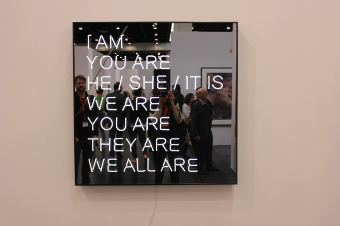
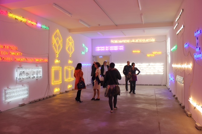 from the top: Robert Montgomery "The City is Wilder Than You Think and Kinder Than You Think (Recycled Sunlight Poem)", 2011 // Jeppe Hein "I am", courtesy Johann König, Berlin // Joseph Koshut, installation view 2013, courtesy Galerie Sprüth Magers, Berlin // photos by artfridge