
all works © Patric Sandri
Patric Sandri is sometimes being asked about the Zurich Concrete Art group, which was founded in the 1930s. With their vivid colours and reduced vocabulary of form, the works of the young Swiss artist, who studied in Lucerne and at the Royal College of Art in London, do indeed evoke associations with Max Bill. Sandri sees himself first of all as a painter, who seeks to break with tradition through examination of objecthood. Here especially the materials that he uses for his works play a major role. If Sandri does not invade the space by layering, his works seem to retain flatness in terms of the media specificity. But because his examination of colour takes place at the edges, the illusion of three-dimensionality does not happen on the surface of the painting but outside its particular body.
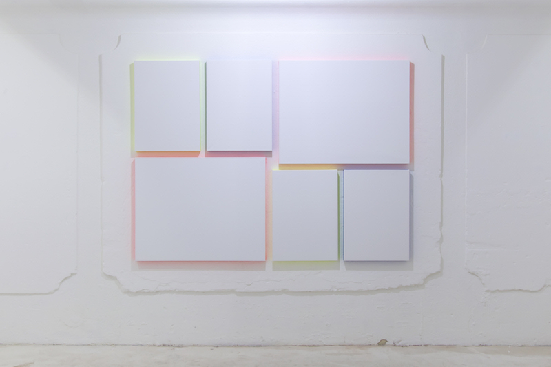
Jürgen Dehm: Patric, you basically keep to the traditional form of panel painting with its rectangular shape. Rectangles are then again reoccurring on the surface of the picture, but also outside the picture’s edges, staggered, layered, or clustered with other rectangles. Why do you hold on to the rectangle so vehemently?
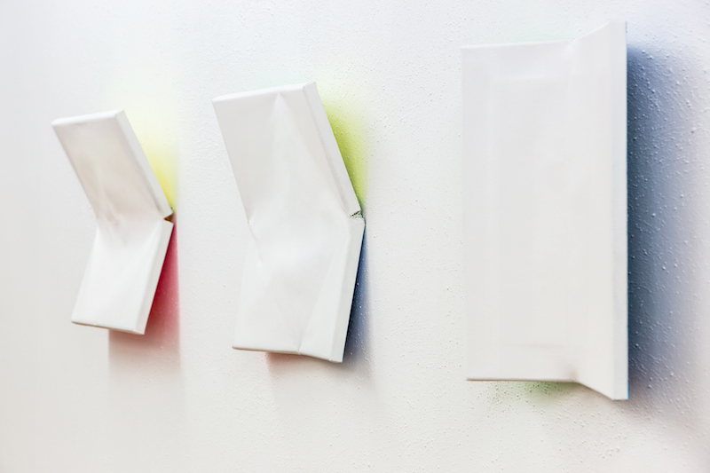
Patric Sandri: In painting I am interested in the canvas on the stretcher frame, the object itself. Or the canvas as an architectural element. When I start making a work, the first step is the analysis of this object, which has a sculptural character, displays various norms or qualities, depths and interfaces. Hence, I give these often neglected components of painting a meaning.
JD: You do not seem to be interested at all in the canvas as a frame, an arena, in which something takes place.
PS: I have been preoccupied with intermediate and exterior forms for some time. I am trying to find corresponding personal systems and visualisations. When it comes to industrially manufactured canvasses, the rectangular frame is usually a given condition, an overlooked fact. I am approaching the canvas, that – just like the model of the primary colours – provides a sheer infinite scope of possibilities due to its simplicity. I am mainly intrigued by the idea of reversing the traditional panel painting, which depicts something three-dimensional as two-dimensional. Through my painterly interventions at the edges of the canvas, respectively its depths and irradiation onto the wall, the three-dimensional object of the canvas is projected two-dimensionally to its base.
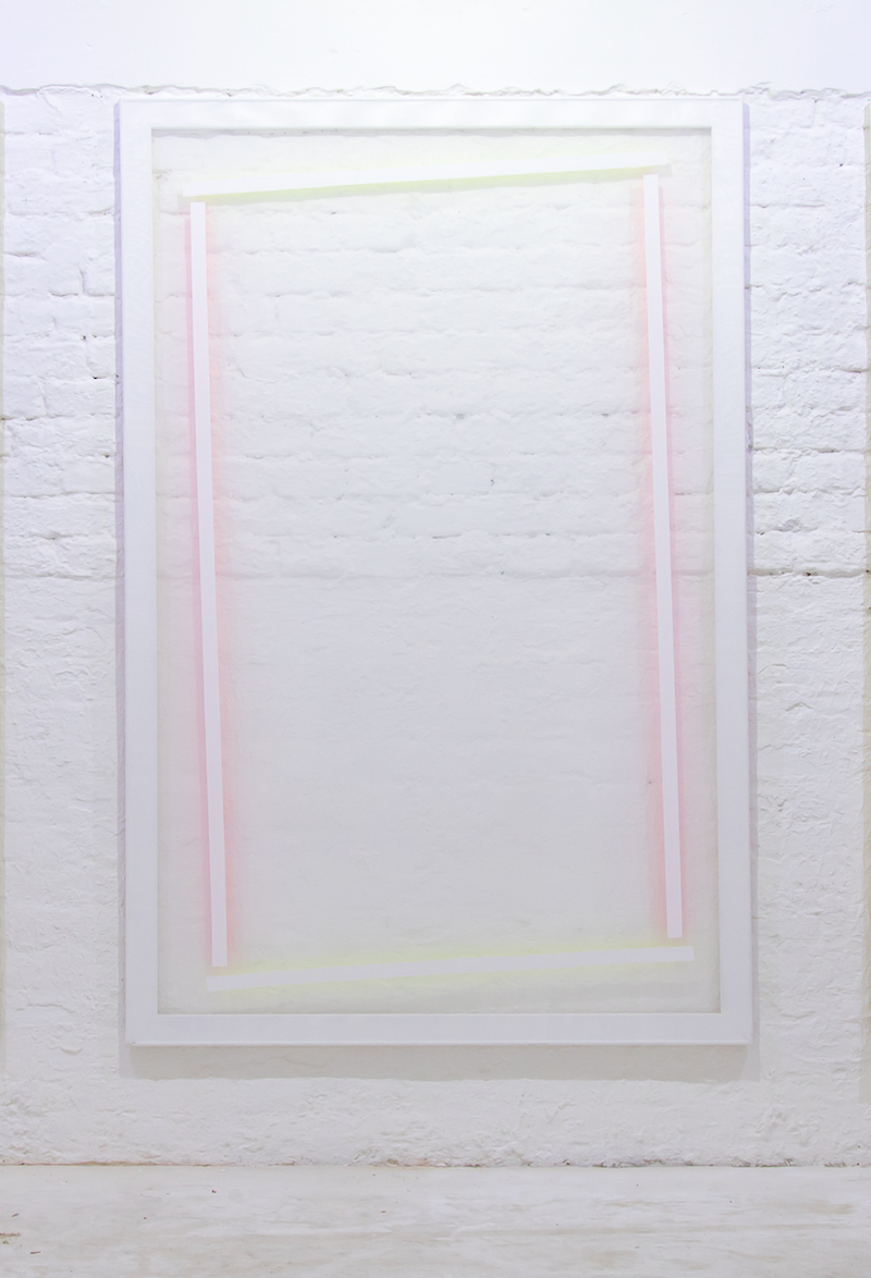
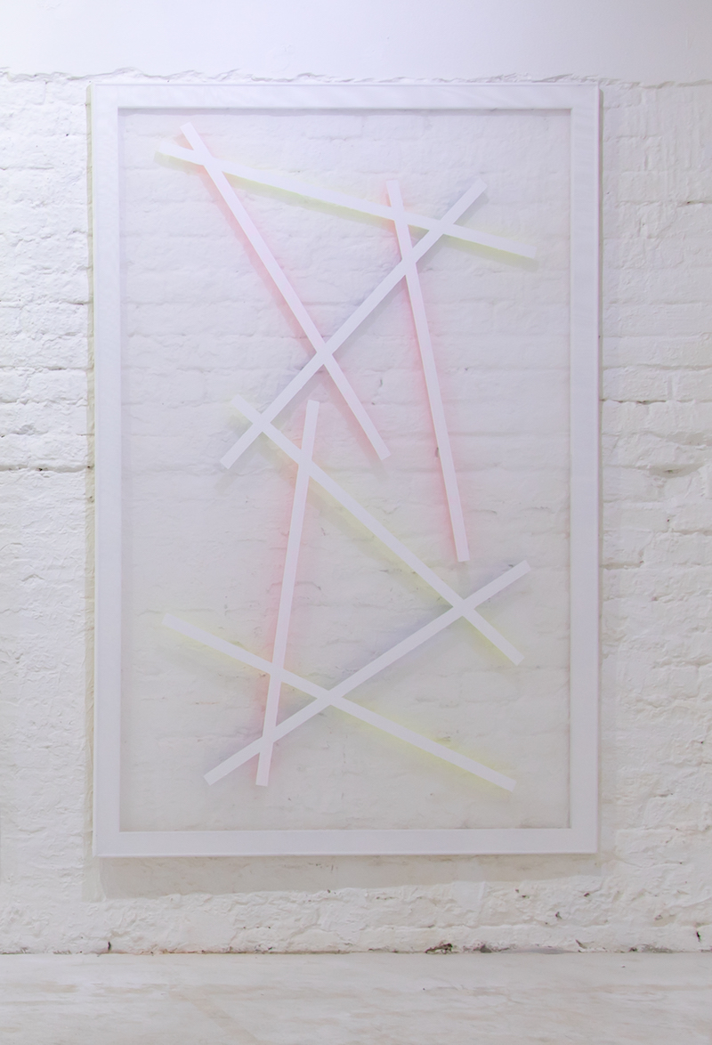
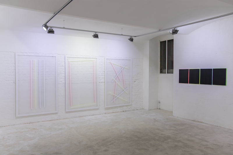
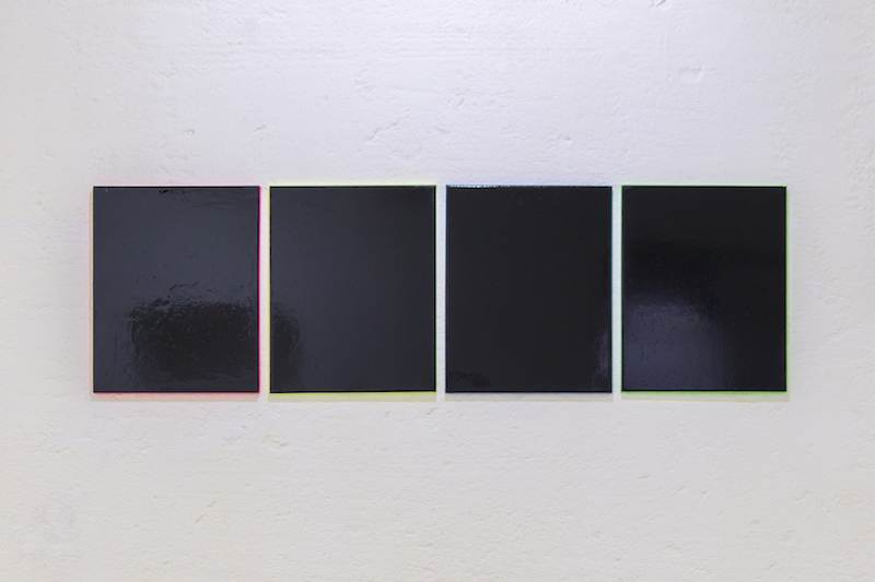
JD: Some of your pictures gain an almost spiritual element through the fact that the edges are painted in neon colours. Displayed on a white wall these works evoke an enormous luminosity, they appear to be surrounded by a nimbus.
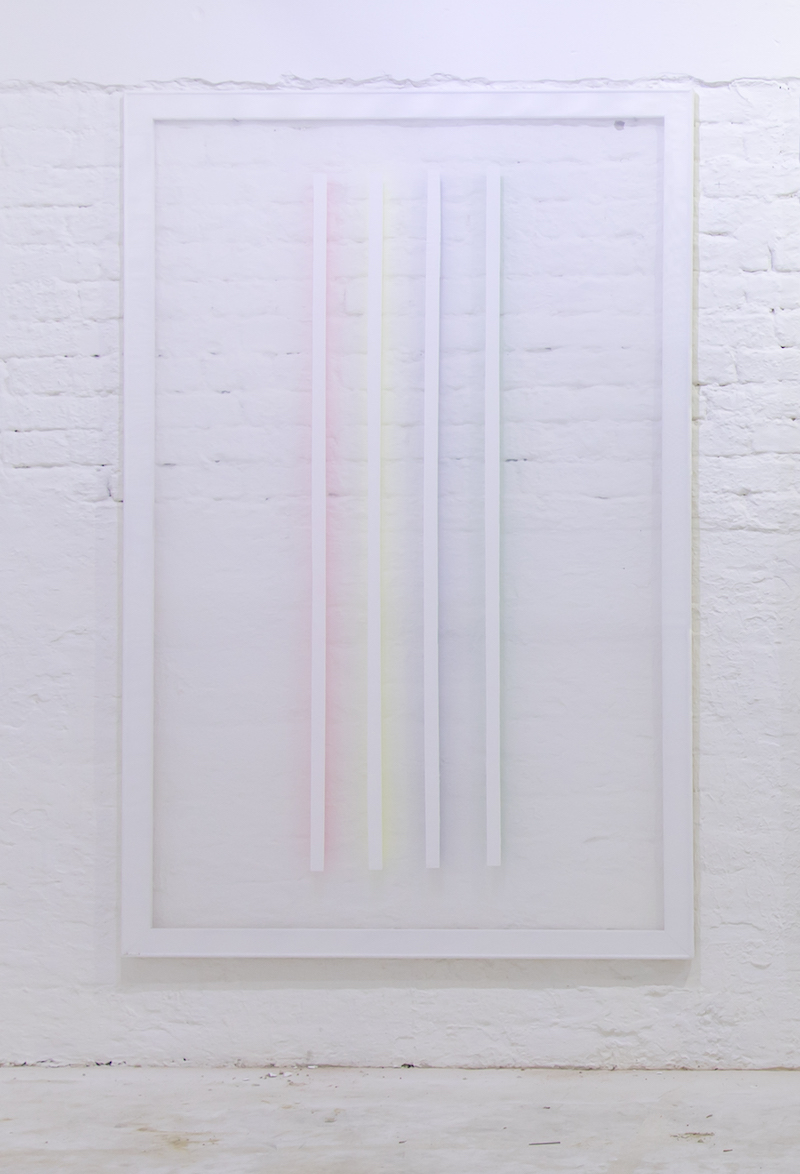
PS: I explore the medium of painting and examine perceptions and the aspects of seeing. Mistakes and contradictions in the understanding of the perception, for example through the play with illusion, deception and visual irritation are important aspects that influence the ideas and composition of the works. I question the role and function of the picture and develop non-figurative painterly objects, the meaning of which is revealed through the act of observation. During the work process I dissect, explore, and connect the constituents of painting into a new system. Light completes the paintings or often even forms an essential part. This is thematised solely by way of painterly interventions. The colours of the painted edges on the backs of the painting and on the stretcher frames shimmer, reflect and radiate through transparent fabrics onto their background. Thus the front and the back of the painting as well as the stretcher frame become part of the composition of the content of the picture and also the wall turns into an essential element. Basically I am not a religious person, but I am aware that such a connection could be established due to the luminosity of the colours I use and their irradiation onto their base, respectively the white wall.
JD: You are not using any neon lights, only neon colours, still the relation to Dan Flavin is apparent.
PS: I think that Dan Flavin’s approach to amalgamate light, object and space is still very relevant today. I try to translate the light that is made visible and is elevated to being the subject of the reception, into painting through the use of colour and its effect. I also see parallels between the conventional rectangular shape, the norm of the industrially manufactured canvases and Flavin’s neon lights, which do serve as light sources in everyday life and turn to art objects in Flavin’s work.
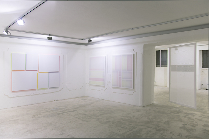
JD: References to art history play an important role in your work, which also becomes evident in your current exhibition ‘Untitled to’ at Lisabird Contemporary in Vienna. By entitling all of your works ‘Untitled’ you consciously follow the tradition of the non-representational in art since the 1960s. But still you indicate through additions in brackets – more or less – to whom these works are referring to.
PS: I have been wanting to have an exhibition with the title ‘Untitled’ for some time. The works are actually homages to artists, whose works, concepts, approaches I very much appreciate. They are personal interpretations of particular artworks, methods and approaches. These homages are sometimes more, sometimes less apparent, only the initials of the respective artist are part of the title. ‘Untitled (to L.B.)’ is an homage to Leon Berkowitz. I have chosen these titles to indicate my references in a more subtle way, to preserve the enigmatic aspect of my works.
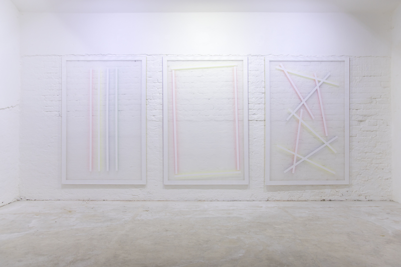
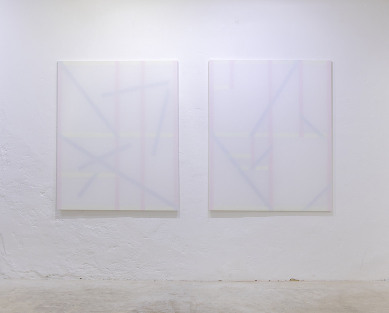
JD: In other works of yours, the material that covers the stretcher frame is transparent and allows the view through, or behind the picture. How deeply are your pictures rooted in two-dimensionality?
PS: I analyse the picture and its architecture and toy with the approaches to classical painting and panel painting, especially with the aspect of illusion. Although I think that ‘visual irritation’ might be a more suitable term for my works, because I reveal basically everything to the recipient, if he or she only takes the time to look closely. I take the elements of the painted picture, which have been predefined for centuries and turn them into the subject of my work. And because my works feature transparency, one can also perceive the space in front and behind the picture, the conditions of painting are disclosed. This is an irritation evoked by colour and form. And still one simultaneously perceives it as a construct.
JD: The illusive effects of your works occasionally distract from the fact that they are only possible through a precise choice of materials. What role does the choice of materials play for you?
PS: The choice of materials is essential. I often find these in hardware stores or textile shops. This is followed by thorough testing, in order to find which material or which fabric displays the most suitable characteristics for the respective concept. I am intrigued by working with industrial materials. Thus the ‘paintings’ virtually turn into industrially manufactured puristic objects. And with this production method I am of course referring to the 1960s again, when mass production and reproduction became a central subject in art, as well as the use of acrylic paint, spray cans and so on.
JD: Why and when did you decide to use neon colours?
PS: Around 2013, while I was working with reverse glass painting, mirroring and the canvas as an object, I discovered the effects of colour projected onto the wall. I was really interested in it, because of the impact light has on my pictures. The light is virtually painting the pictures. And through the reverse glass paintings and their distance to the wall, I came to understand what actually happens to the colour: I started my research and I discovered the neon colours. Their pigments reflect more light from the visible spectrum than they absorb. They shine – so to speak – by themselves, they create an artificial light effect. The neon colours I work with are also used for industrial purposes. So there are indeed parallels to Dan Flavin. But my approach remains anchored in the painterly, thus depicting light through colour, something already the impressionists were attempting to do.
JD: To Mondrian simplicity constituted the most perfect state for humankind. What do you think about this?
PS: I am not sure if I can fully agree with this statement. I think it is very fascinating to play with simplicity. Also the simple evokes complex questions. What I like about it is, that simplicity reduces the amount of rules. This has not necessarily to be understood as being political.
Website: patricsandri.com
Current Exhibition:
Patric Sandri
Untitled (to)
13.02. - 19.03.2016
Lisabird Contemporary
Brucknerstrasse 8
1040 Vienna, Austria
Opening hours: Wed. - Fri.: 11 - 18h; Sat: 11 - 16h
all works © Patric Sandri